Editing fields
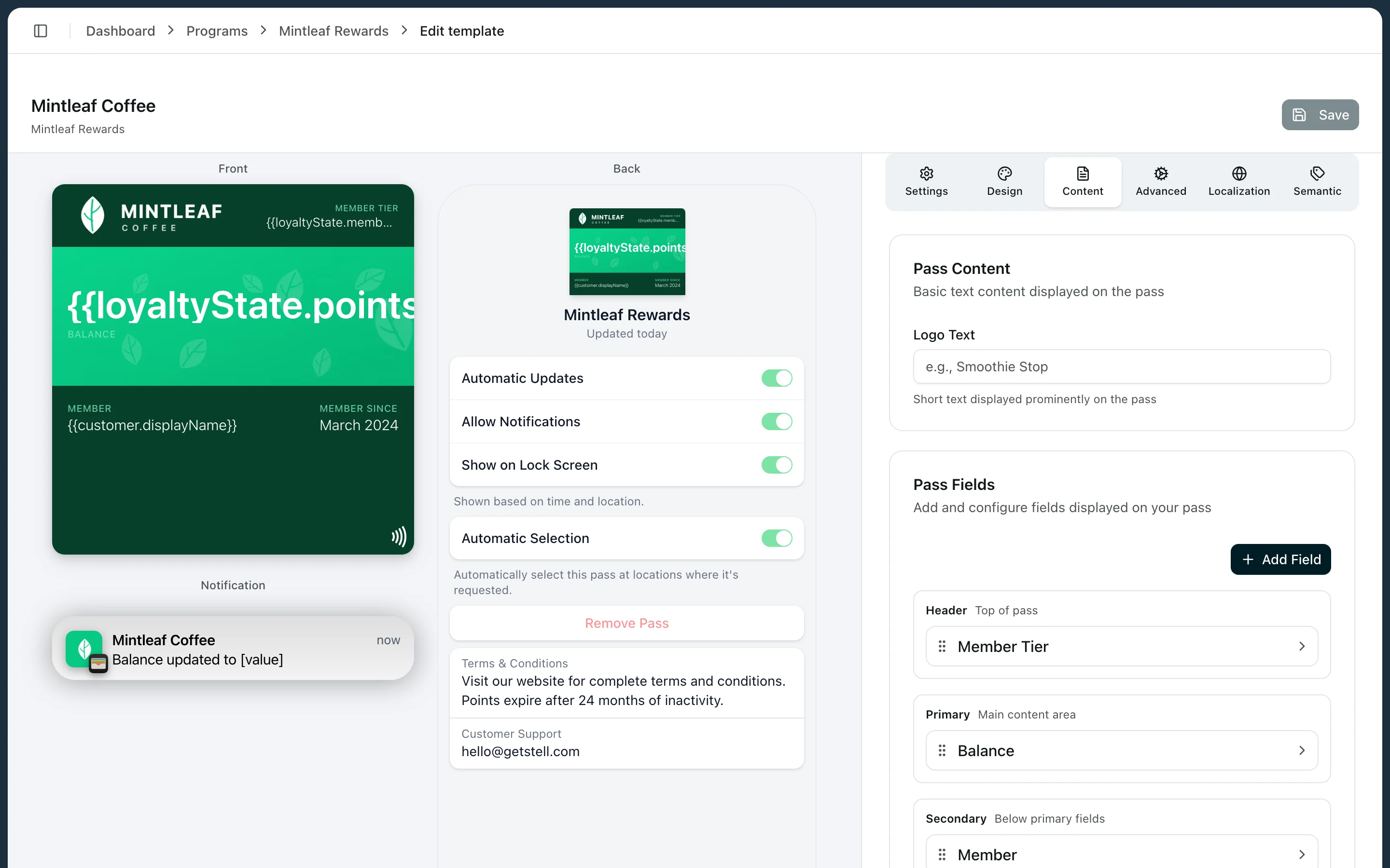
- Label — the small heading (for example “POINTS”). Optional.
- Value — the text shown. Type static text, insert placeholders with the placeholder picker, or mix both:
Points: {{loyaltyState.pointsBalance}}. - Change message — an optional notification text shown when this field’s value changes, like “Points changed to %@”. This is how customers get a lock-screen ping when their balance updates.
Placeholders
Placeholders are{{…}} tokens replaced per customer when the pass is rendered. The most useful ones:
| Show | Placeholder |
|---|---|
| Customer’s name | {{customer.displayName}} — or {{customer.firstName}} / {{customer.lastName}} |
| Points balance | {{loyaltyState.pointsBalance}} |
| Stamps collected | {{loyaltyState.stampsCollected}} |
| Membership tier | {{loyaltyState.memberTier}} |
| Your customer ID | {{customer.externalId}} |
| Program name | {{programName}} |
| Pass expiry date | {{expirationDate}} |
| Visits used (entry passes) | {{entryState.visitsUsed}} |
Placeholders insert values — they don’t calculate.
{{loyaltyState.pointsBalance}} works; {{loyaltyState.pointsBalance}} + 10 shows literally that text.Dates
Also in the Content tab:- Expiration date — when the pass should stop being valid.
- Relevant dates — moments when the pass should surface on the customer’s lock screen, useful for events.
A sensible field layout
For a typical loyalty card:- Header: points balance — visible even when the pass is stacked in the wallet.
- Primary: the customer’s name, large on the strip.
- Secondary: tier and member-since.
- Back: terms, support contact, and links.