


The front of the pass
From top to bottom:
Here is every area in place on a real pass — a store card open in Apple Wallet on an iPhone:
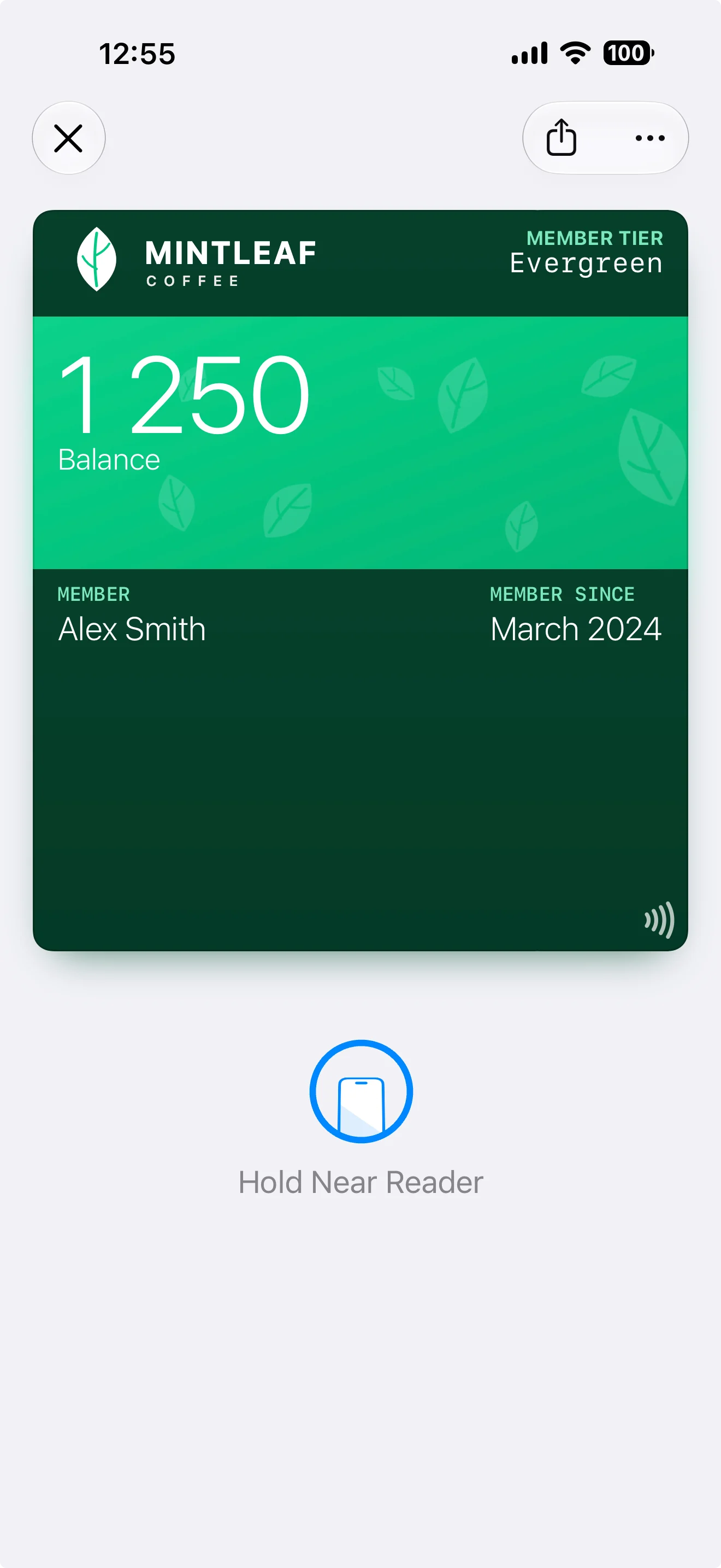
Logo and logo text top-left, a Member Tier header field top-right, the Balance primary field on the strip image, Member and Member Since on the shared field row, and the NFC tap icon bottom-right.
The back of the pass
Customers reach the back through the ⋯ button when the pass is open in their wallet. Back fields hold everything that doesn’t belong on the front: terms, contact details, longer descriptions, links. There’s much more room here, and text can be longer.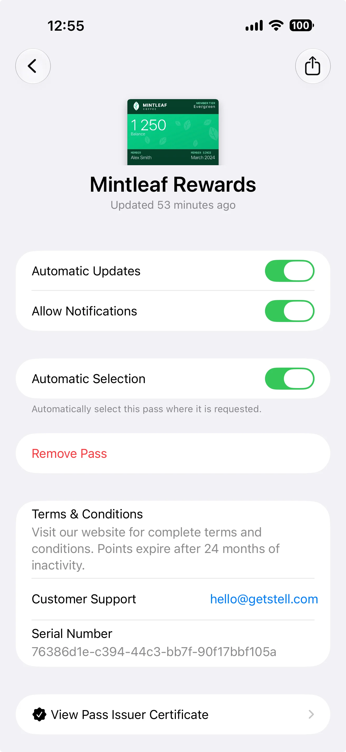
The back of the same pass: your back fields (here Terms & Conditions and Customer Support) sit below the wallet's own controls, like automatic updates and notifications.
The editor also offers footer fields. These only appear on the generic poster layout, as a final line at the very bottom of the pass — on other layouts, keep your content in the areas above.
Pass styles
The pass style (chosen in the Settings tab) decides the overall layout — most importantly whether the pass uses a strip image or a full background:
Switching style keeps your fields and images but changes how they’re laid out — check the preview after switching, since a strip image won’t show on a background-based style and vice versa.
Layout by style
Each style arranges the same areas differently. The two poster variants are the new, modern pass presentations: full-bleed artwork carries the design, and they activate automatically on newer iPhones when your template has poster artwork.- Store Card & Coupon
- Generic
- Generic Poster
- Event Ticket
- Poster Event Ticket
- Boarding Pass


How this knowledge maps to the editor
- The wallet draws the pass; you supply the ingredients. You can’t move the areas around — you decide what goes in each area.
- Less is more: passes are glanced at, not read. A strong image, one primary value, and a couple of supporting fields beat a crowded layout.
- Field values can be dynamic — showing each customer their own name, balance, or tier. See fields and dynamic content.
Want to go deeper? Apple’s developer documentation covers the underlying pass format in technical detail — see Wallet Passes on the Apple Developer site. You won’t need it to use the editor; everything merchant-relevant is covered in these pages.