Anatomy of a program email
A good program email is short and has exactly one call to action. The Mintleaf Rewards announcement below is annotated top to bottom: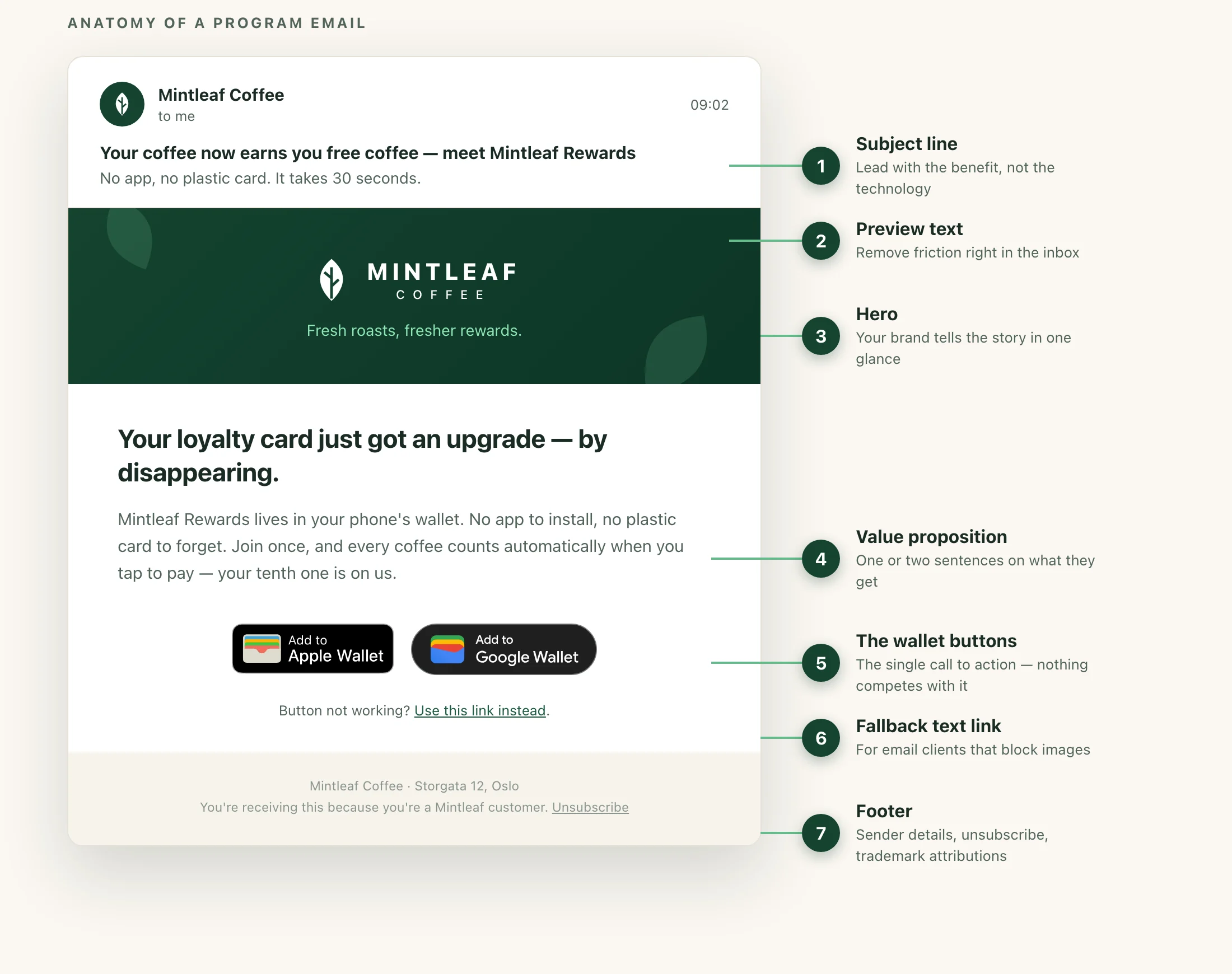
- Subject line — lead with the benefit, not the technology. “Your coffee now earns you free coffee” beats “Introducing our new digital wallet pass solution”.
- Preview text — the line shown next to the subject in the inbox. Use it to remove friction: “No app to install — it takes one tap.”
- Hero — your brand and the pass itself. Showing the pass on a phone tells the whole story in one image.
- Value proposition — one or two sentences on what the customer gets and why it’s effortless.
- The wallet buttons — the single call to action: Add to Apple Wallet and Add to Google Wallet buttons, side by side. Nothing else in the email should compete with them.
- Fallback text link — a plain link under the buttons (“Button not working? Use this link”) for email clients that block images.
- Footer — your usual sender details and unsubscribe link. If you market in the United States, the wallet providers expect their trademark attributions here — see using the wallet badges.
Example emails
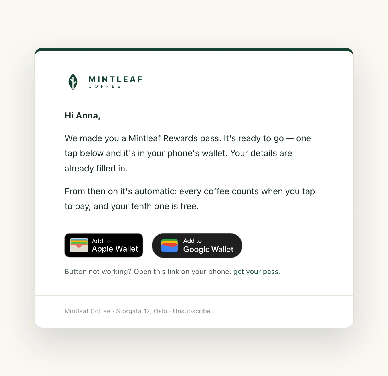
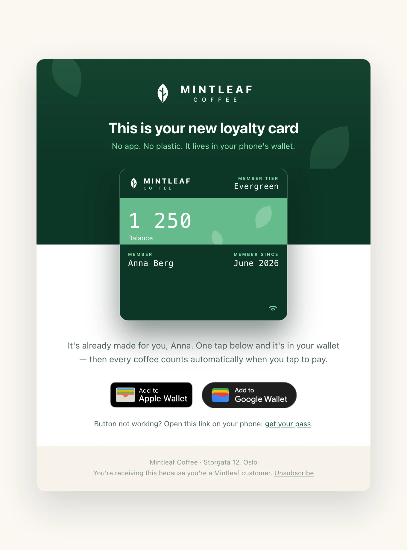
Brands lead differently — some with a full campaign production, some with a personal note, some with the product itself. The three Mintleaf examples below show the range; pick the style closest to your brand and model your email on it. The structure never changes: one message, one call to action.- The announcement
- The personal note
- The pass showcase
Campaign style — for your full mailing list at launch. A branded hero, the value proposition, and one button. Recipients may or may not be in your CRM, so the call to action links to the enrollment flow.Subject: Your coffee now earns you free coffee — meet Mintleaf Rewards
Preview text: No app, no plastic card. It takes 30 seconds.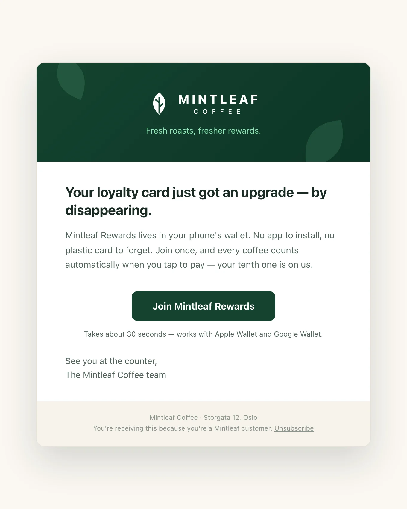
Preview text: No app, no plastic card. It takes 30 seconds.
Making the buttons work
The wallet buttons in these emails come from Stell’s configurator: it generates an email-safe HTML snippet with both buttons, official badge images in your language, and per-recipient links your email tool fills in at send time. The setup — snippet, identifiers, localized images — is covered on the wallet button widget page; don’t hand-build the links. If a recipient isn’t in your CRM — a newsletter subscriber who never bought anything, say — the one-tap links can’t identify them. Send those recipients to your enrollment link instead, where the enrollment flow collects their details.Before you send
- One call to action. If the email also promotes this month’s blend, the pass loses. Give the program its own send.
- Design for the phone. The wallet add happens on a phone, so most recipients will read the email there. One column, big buttons.
- Segment members from non-members. Members get the one-tap invitation; everyone else gets the announcement with the enrollment link. A “fill in this form” email to someone you already know feels careless.
- Test on real devices. Send the email to yourself and a colleague, and add the pass on a real iPhone and a real Android phone — not just a desktop preview.
Email reaches customers who don’t have the pass yet. Once they’ve added it, Engage push notifications reach them directly on the lock screen — no inbox to fight through. If you don’t see Engage in your navigation, it isn’t enabled for your company — contact support.