

Counter and wall
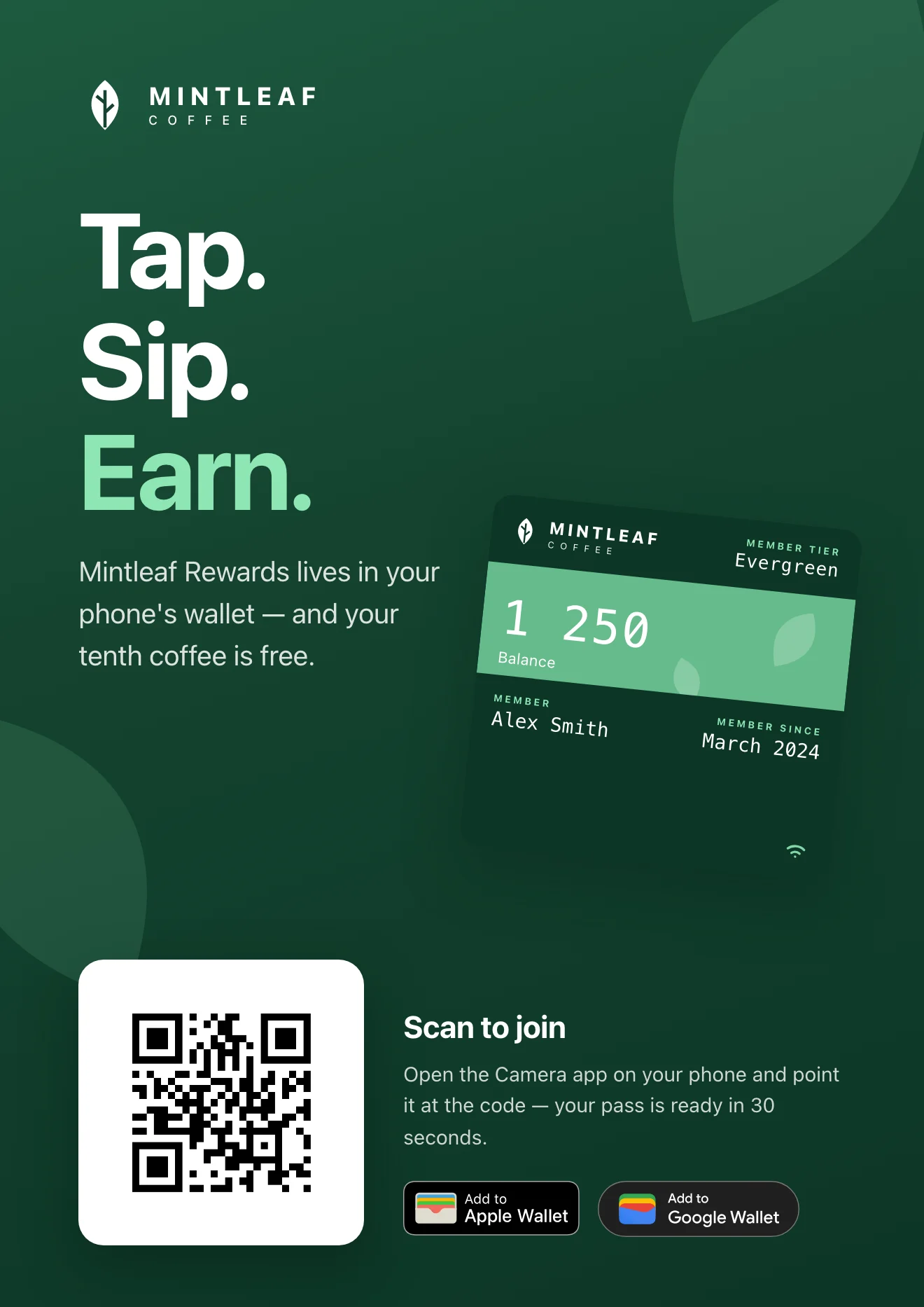
The poster works from across the room. The QR code works from arm's length.
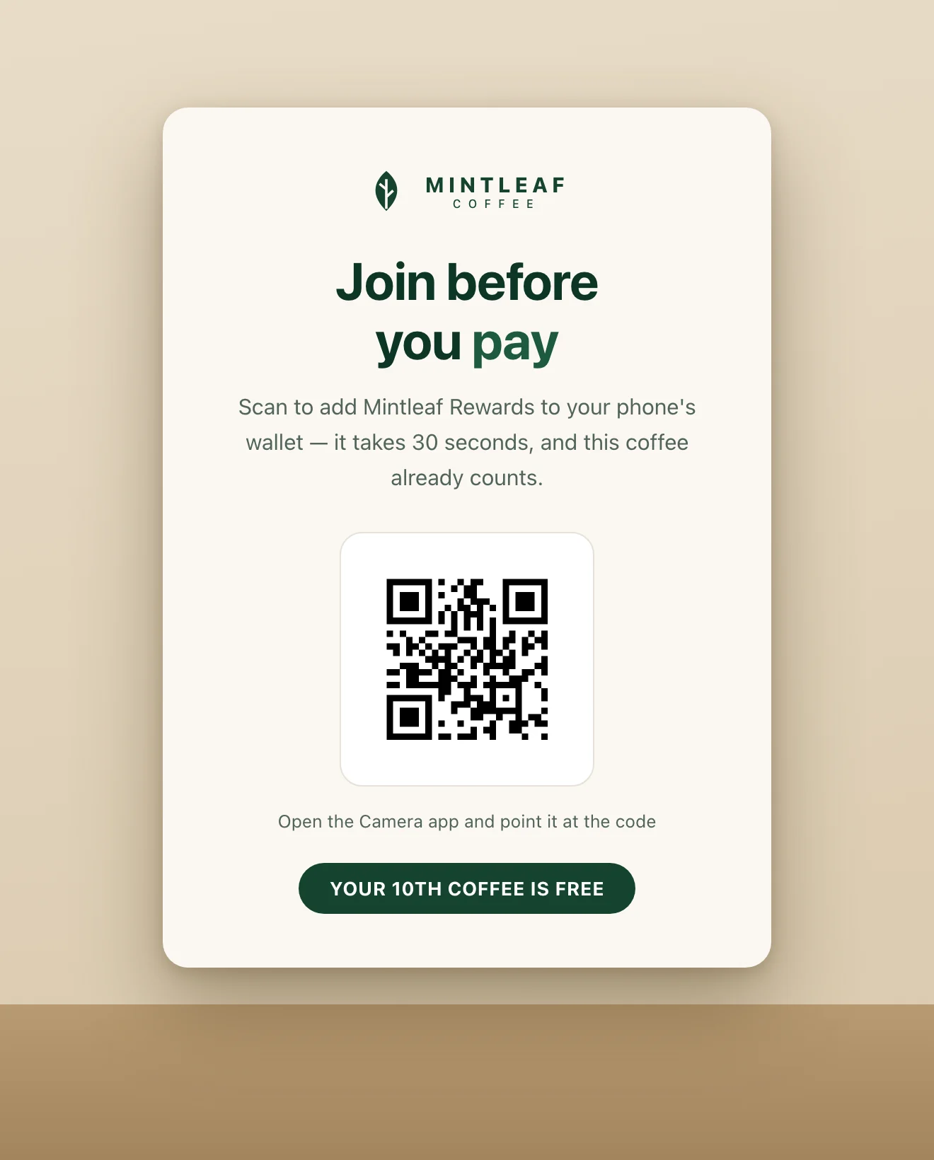
The counter card catches the customer with time to spare and phone in hand.
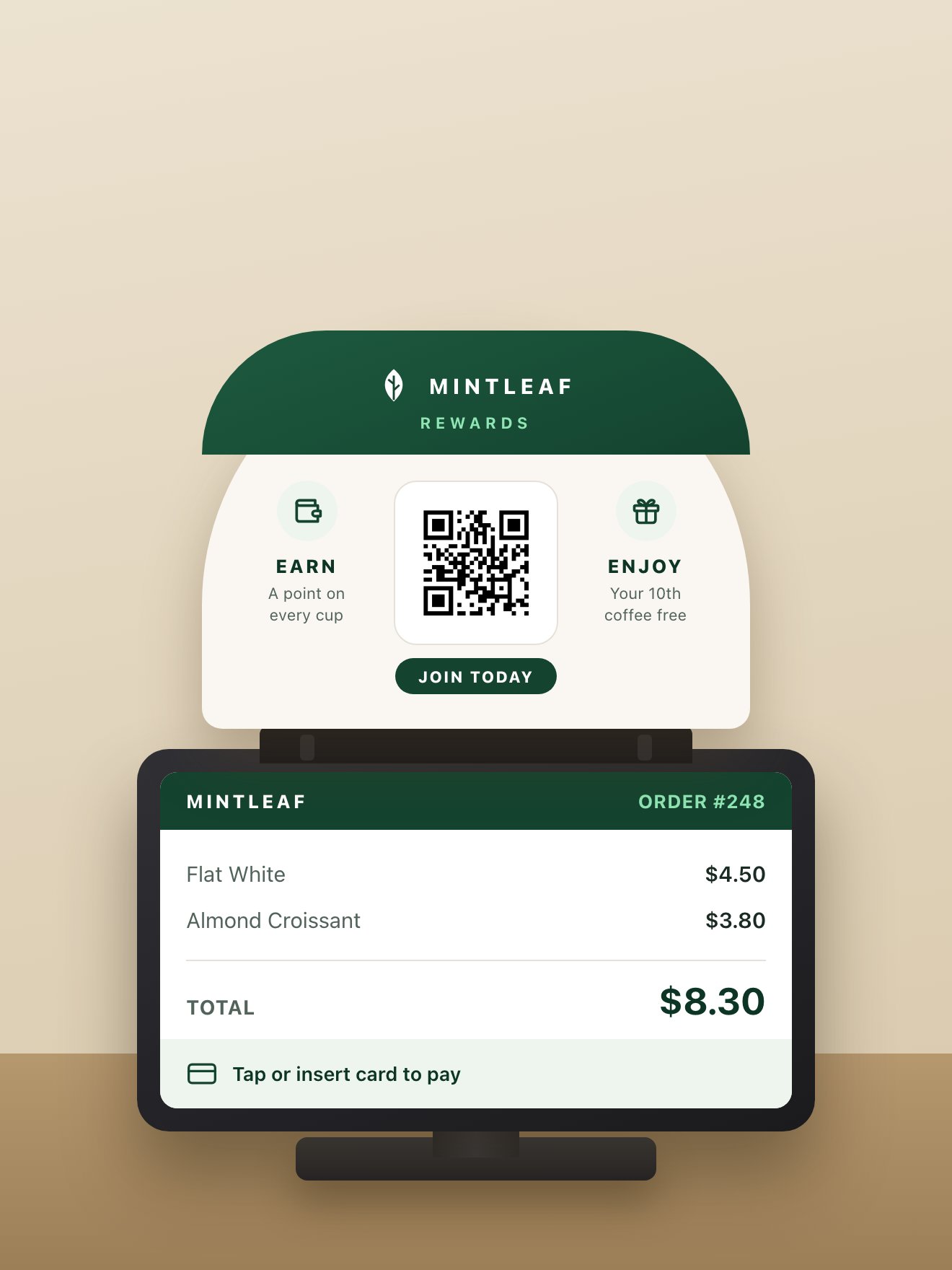
A register-topper sits on the terminal itself, the one sign every paying customer looks straight at.
Stands and banners
Counter material catches customers who are already paying. Stands and banners catch the ones still walking around: in the queue, between the shelves, browsing.- Floor stand or easel. Placed in the walkway where customers queue or browse. The strongest version is radically simple: a giant QR code and a single line. No headline contest, no paragraph. The code is the message, and it scans from several steps away because of its size. Put your logo in the center of the code if you like, and keep the line direct: “Scan the QR code to join Mintleaf Rewards.”
- Hanging banner. Suspended from the ceiling, visible across the whole store and above the shelf lines. It works at two distances: the headline and brand read from across the room, and the QR code takes over once the customer is close. Hang it where people naturally stop, above the queue, the till, or a central aisle, and low enough that the code is scannable without stretching.
- Illuminated totem (lightbox). A slim, backlit floor column. Same single-line-and-QR discipline as the floor stand, but it glows: it holds its own in a dim corner, a shop window, or after dark, and reads as a permanent fixture rather than a poster. Place it where people pause, and keep the QR code large.
- Outdoor A-frame. A pavement sign on the sidewalk, catching customers before they’re even inside. Keep it to one headline and a QR code big enough to scan from a stride away, and check your local rules on what you’re allowed to place on the pavement.
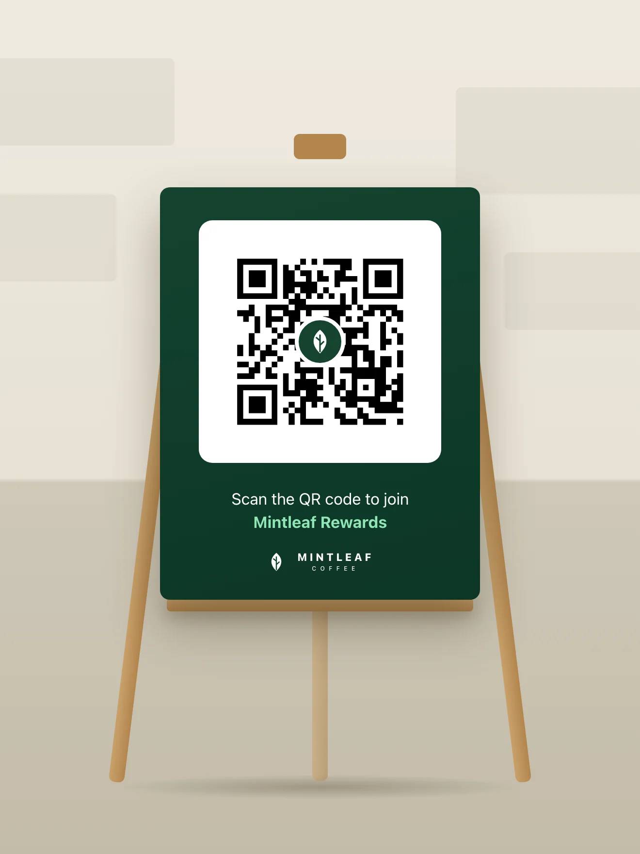
A floor stand in the walkway: a giant QR code and one line. The simplest piece is often the strongest.
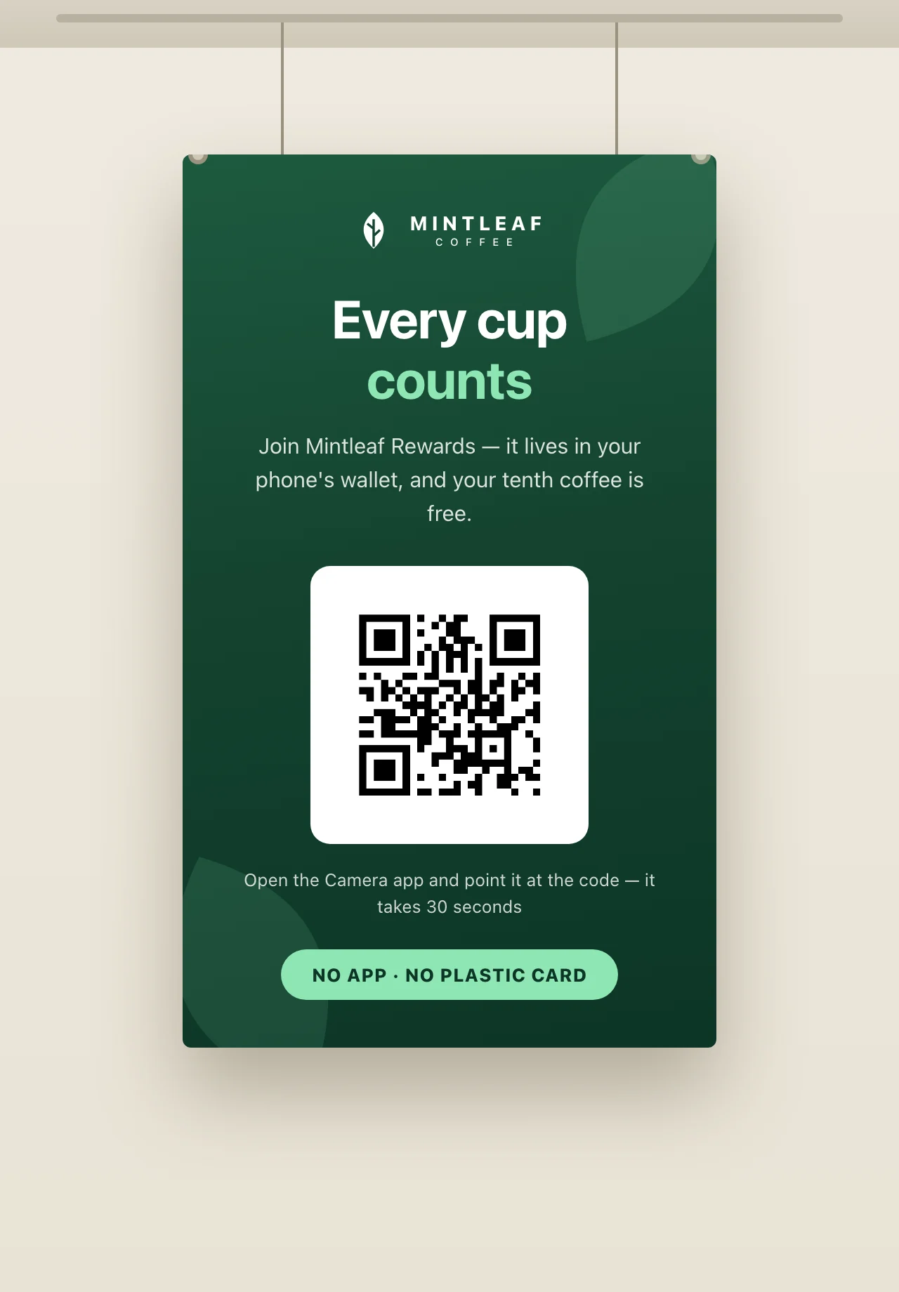
A ceiling-hung banner reads at two distances: headline from afar, QR code up close.
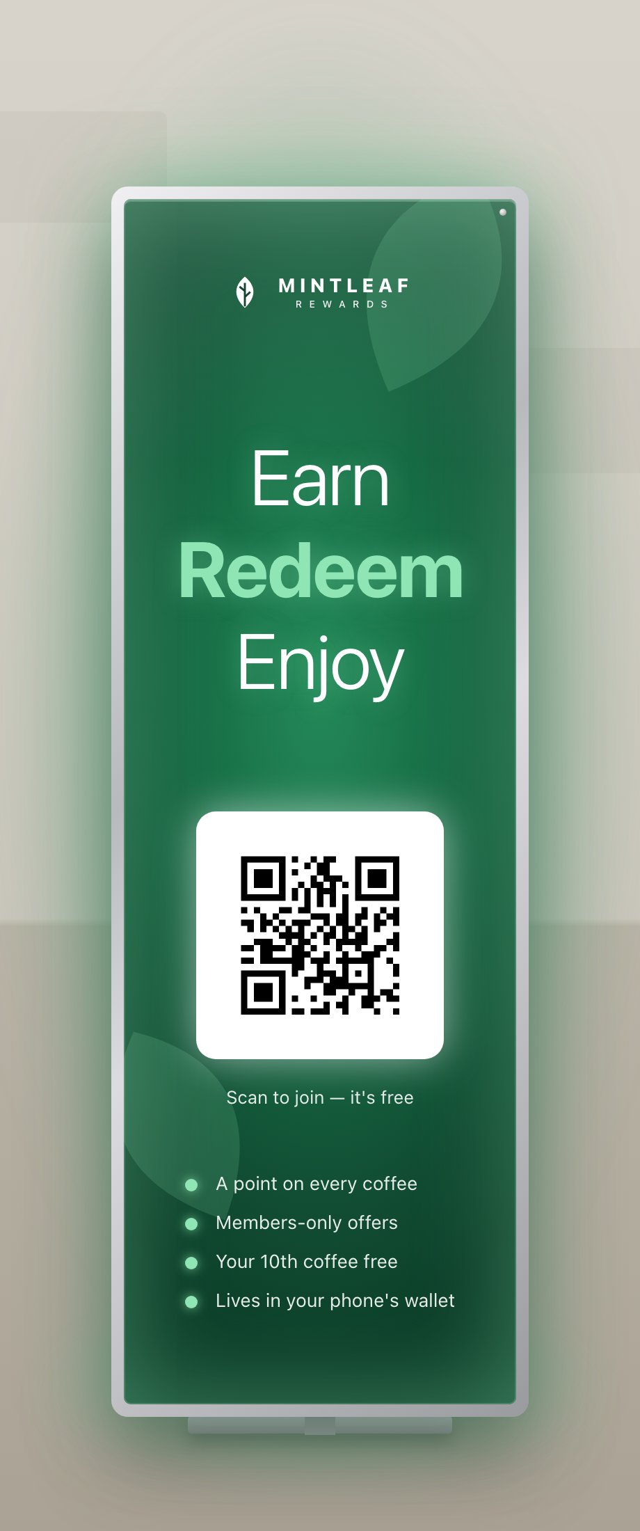
A backlit lightbox totem makes the program glow, strong in a dim corner or after dark.
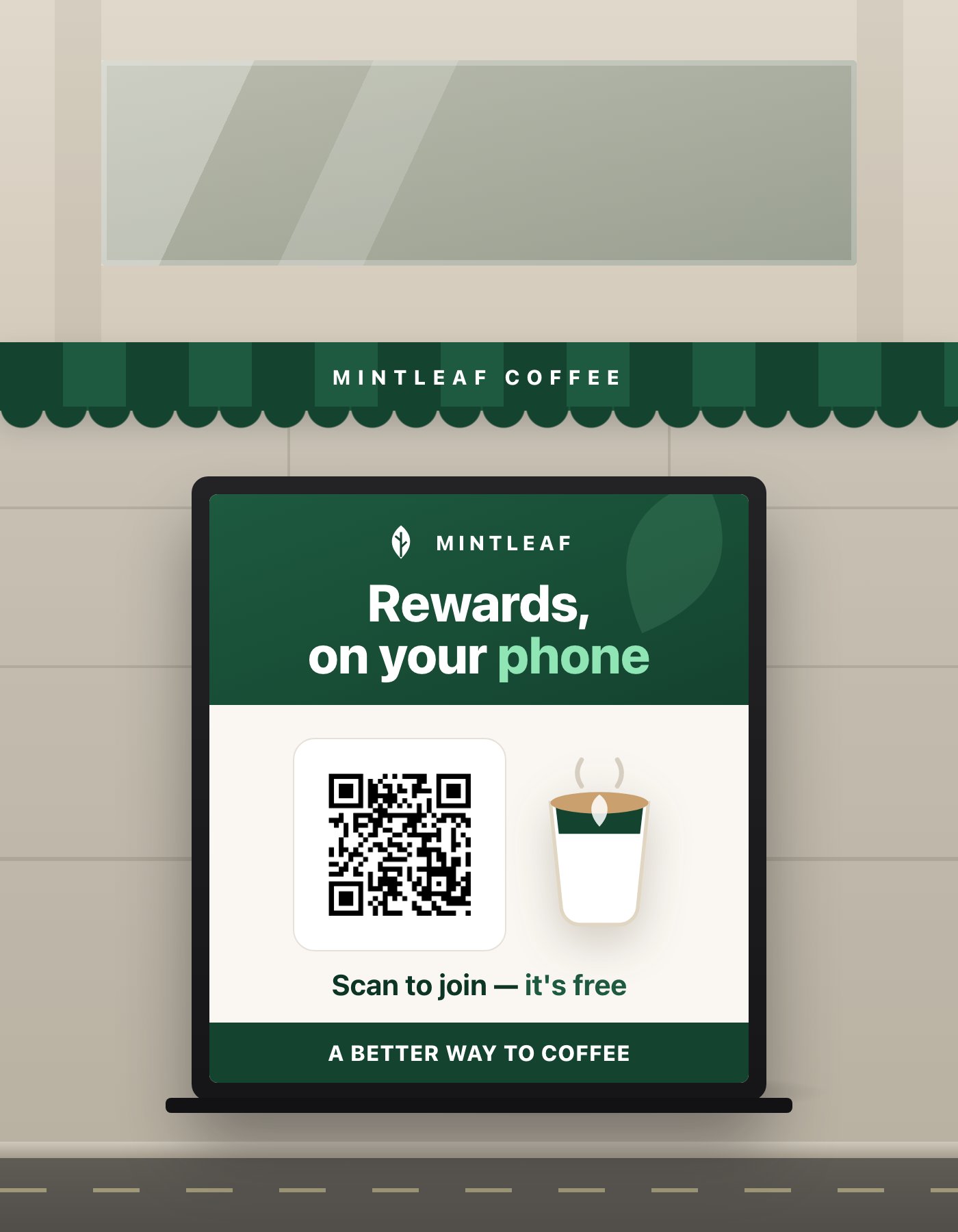
An outdoor A-frame on the sidewalk catches customers before they walk in.
Print rules for the badge and QR
Print is the one channel with its own badge rules. A printed badge can’t be tapped, so it works differently:- Use the print-quality artwork. Badges in print must come from the official EPS (vector) files, never from a screenshot or a web image scaled up.
- Pair the badge with the QR code. The badge tells the customer what they’ll get, and the QR code is how they get it. Apple’s print guidance pairs them with a scanning instruction, for example: “Scan the code to add your pass. Just open the Camera app on your iPhone and point it at the code.” Android phones scan the same code from their camera too.
- Give the badge room. Same clear-space rule as everywhere else. See using the wallet badges.
- Test-scan the proof. Before the print run, scan the actual printed proof, not the PDF on your screen, from a realistic distance, with both an iPhone and an Android phone. For stands and banners, test from where customers will actually stand. A QR code that’s too small, too low-contrast, or printed on glossy curved material fails quietly.
Digital screens
Menu boards and customer-facing displays reach every customer in the store, and they can show more than print: imagery, the pass itself, even motion. Three patterns work:- A dedicated promo slide. Image-led: the pass on a phone, one headline, the QR code with a scanning instruction. Rotate it into your menu loop, or run it full-time on a second screen near the queue.
- A permanent corner. If the screen is primarily a menu, give the program a fixed panel or corner on every slide instead of its own slide, so the QR code never disappears while a customer is reaching for their phone.
- A self-order kiosk. If customers order at a kiosk, the screen is already interactive and right in front of them. Put a check-in prompt on the attract loop, and a “join after you order” step with a QR code at the end. The customer is looking straight at it, phone often already in hand.
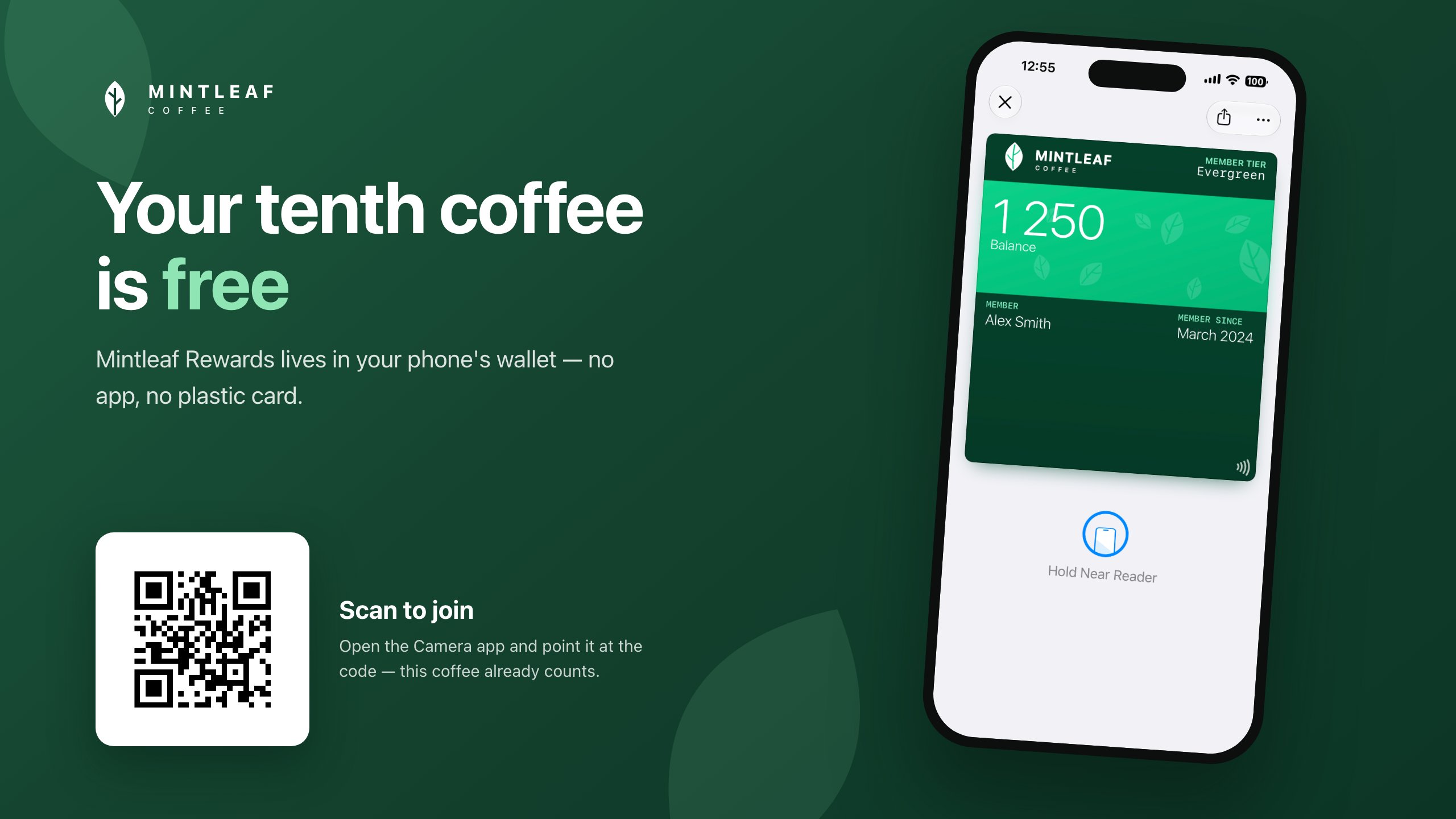
A dedicated promo slide: the pass does the showing, the QR code does the joining.
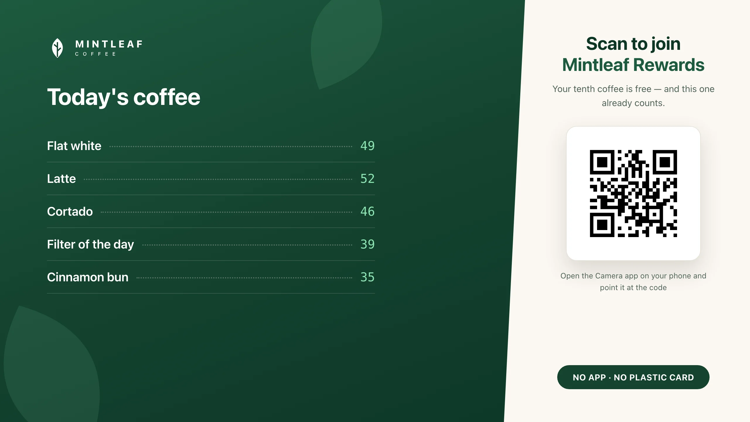
On a menu board, the program gets a permanent panel so the QR code is always on screen.
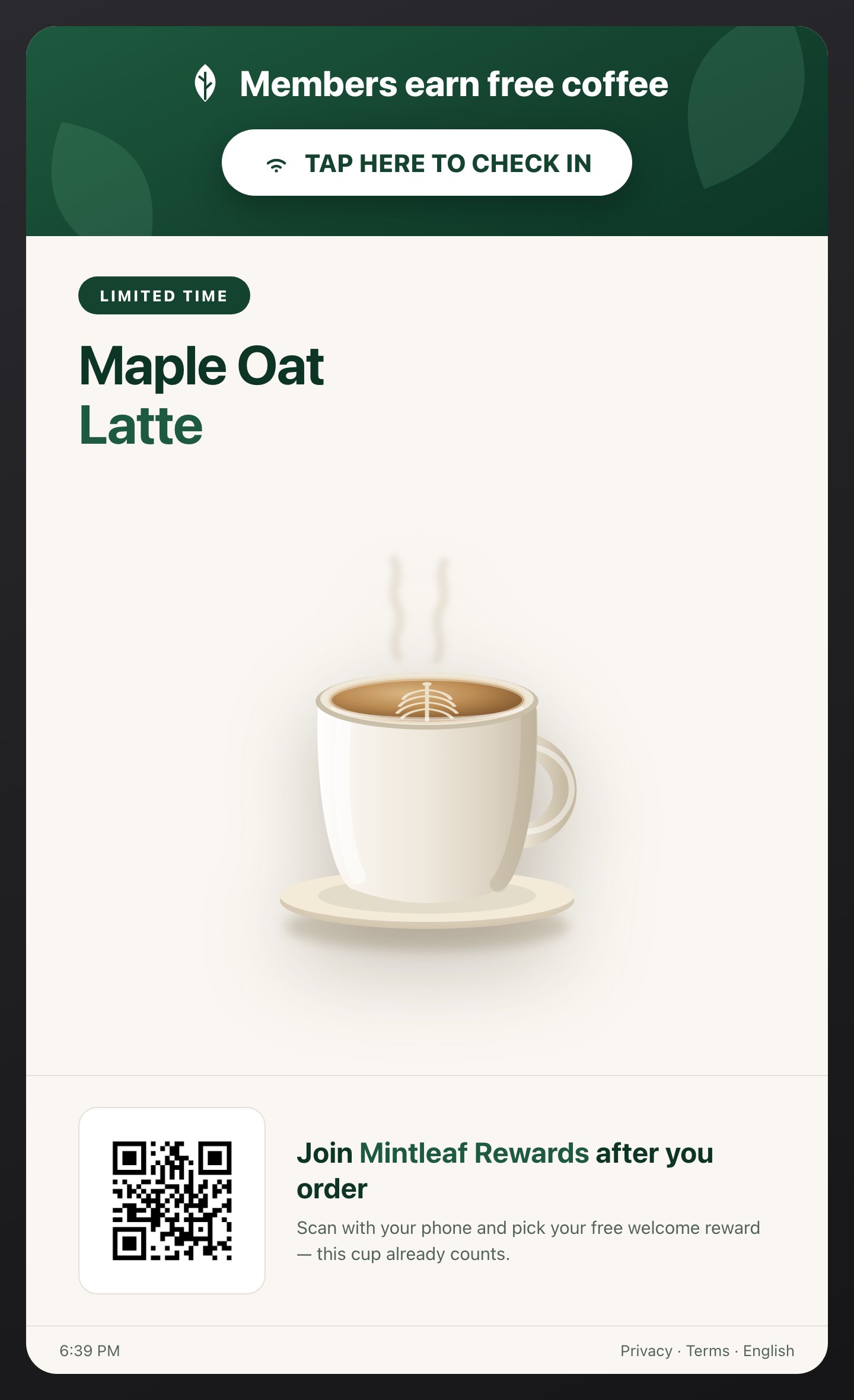
Attract state: tap to check in, scan to join after ordering.
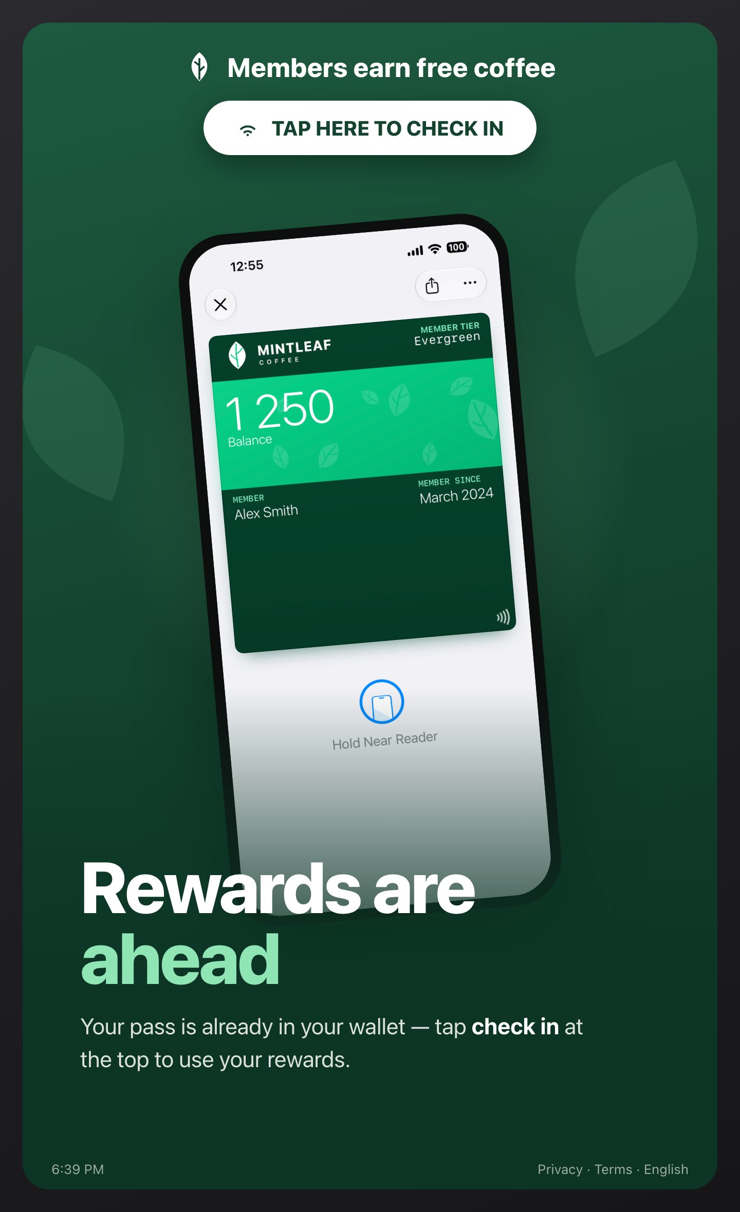
Reminder state: a member's rewards are a tap away.
- Timing. If the promo is a rotating slide, leave it up 10 to 15 seconds. Spotting the code, raising the phone, and scanning takes longer than reading. The permanent-corner pattern avoids the problem entirely.
- Size and distance. Customers scan screens from further away than posters, from behind a counter or above a till. Make the code generously large and test-scan from the customer’s side of the counter.
A tap-to-check-in point
Almost everything above bridges a new customer to their phone with a QR code. A tap point is the other end of the journey, for customers who already carry the pass. A mat or decal placed around a Stell Terminal turns the tap point into a check-in: the member taps their phone, the same tap they use to pay, and the visit is logged automatically. No scan, no app, nothing to type. It earns its spot at the counter precisely because it isn’t a QR code. Returning members get a one-second ritual, and the artwork doubles as a reminder that the program is worth tapping in for.- Keep the copy to the action and the payoff: “Tap to check in. Visit 10 times and your next coffee is on us.”
- It only works where your program is tap-based and a Terminal is present. If your program uses a barcode instead, this piece doesn’t apply. Lead with the QR formats above.
- New customers still need the QR code to join first, so pair the tap point with a nearby counter card or register-topper.
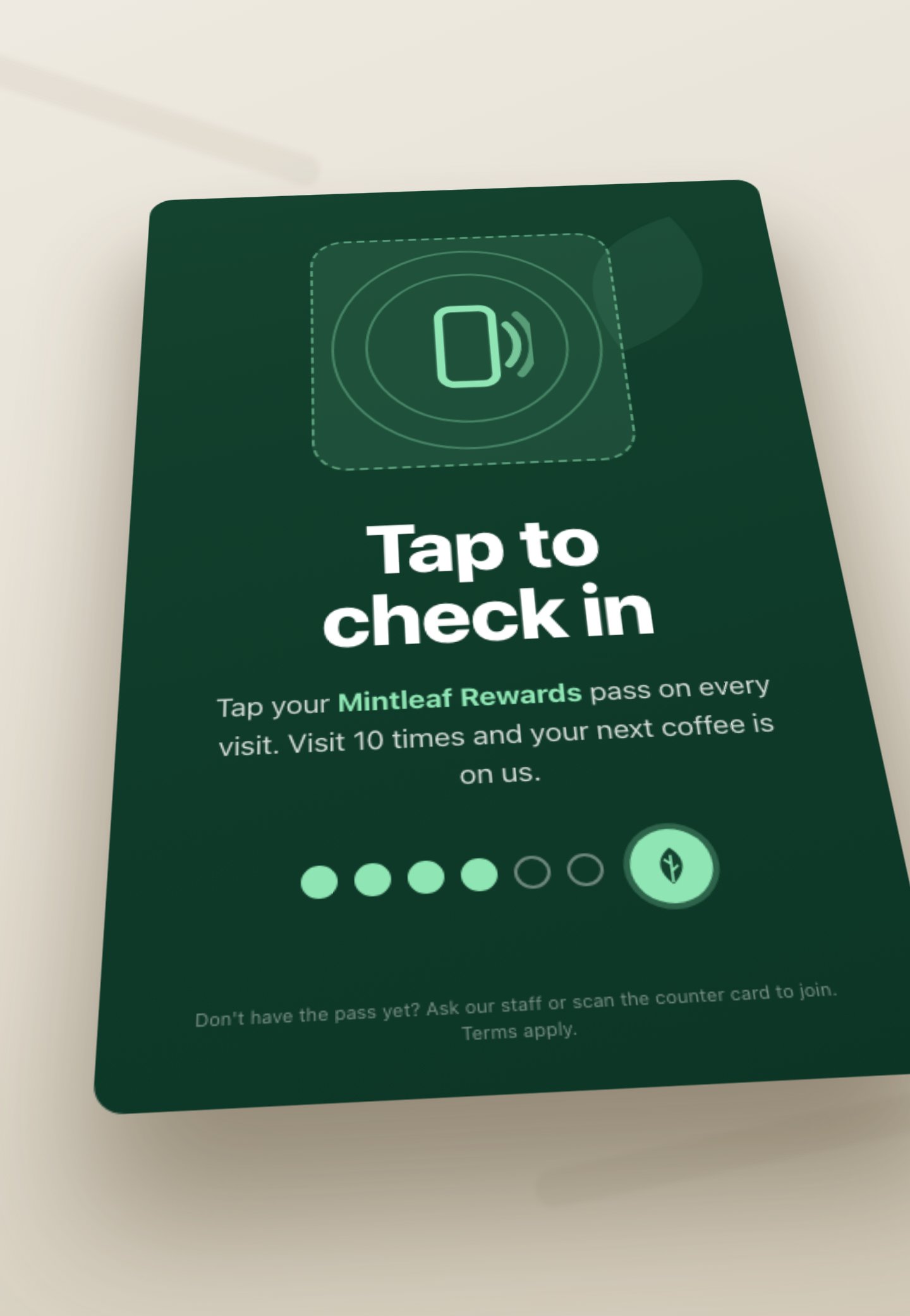
A tap-to-check-in mat is for members, not new customers: tap the pass to log a visit, no scan, no app.
What your staff should say
Material gets attention. Staff close the deal. One practiced line at the till is worth a wall of posters:“Do you have our rewards pass? It’s free, it lives in your phone’s wallet, and you’re in before your coffee’s ready. Want me to show you?”Then point at the counter card. The customer scans, and the staff member watches one enrollment happen. After that they can answer anything. The questions that come up, and the answers:
"Do I need to install an app?"
"Do I need to install an app?"
"Does it work on Android?"
"Does it work on Android?"
"How do I use it?"
"How do I use it?"
"What do you do with my details?"
"What do you do with my details?"