> ## Documentation Index
> Fetch the complete documentation index at: https://docs.getstell.com/llms.txt
> Use this file to discover all available pages before exploring further.
# Anatomy of a pass
> The areas of a wallet pass and how the pass style shapes them
A wallet pass has a fixed set of areas, each with its own job. Once you know them, every control in the [template editor](/pass-templates/overview) maps to a spot on the pass.
 ## The front of the pass
From top to bottom:
| Area | What goes there |
| ---------------------------------- | ------------------------------------------------------------------------------------------------------------------------------------------------------------------------------------------ |
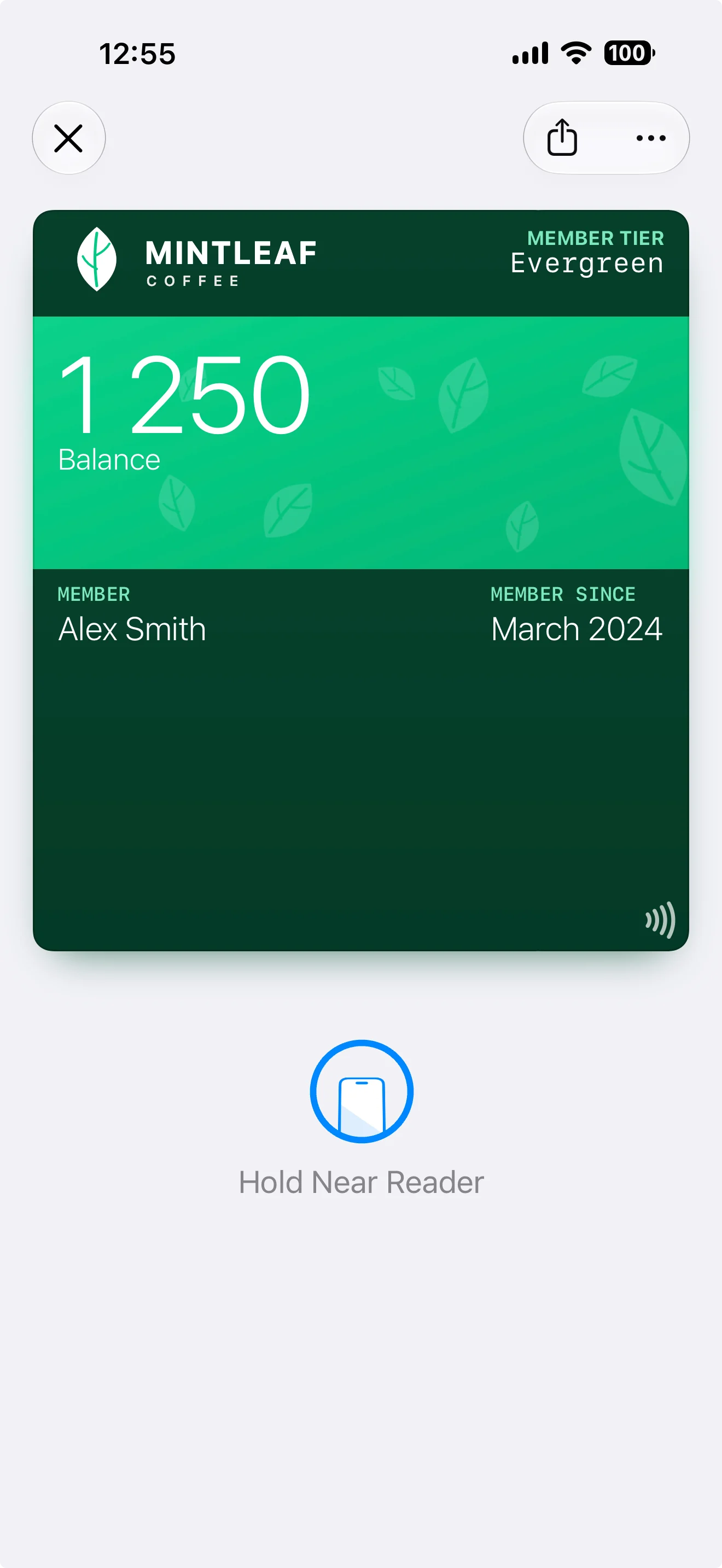
| **Logo and logo text** | Top-left corner: your logo (and optionally a short logo text next to it). This is your brand anchor — it's the first thing a customer recognizes |
| **Header fields** | Top-right corner, opposite the logo. Always visible — even when the pass is stacked with other passes in the wallet — so use them for the single most useful value, like a points balance |
| **Strip or background image** | The visual heart of the pass. Depending on the pass style, this is a **strip image** (a banner across the upper part) or a full **background image** |
| **Primary field** | The pass's headline value, rendered large — for example the member's name or balance. On styles with a strip image, the primary field sits on top of it |
| **Secondary and auxiliary fields** | Rows of smaller values in the middle of the pass — member since, tier, store, and so on. How many fit and how they're arranged depends on the pass style (see the per-style layouts below) |
| **Barcode or NFC** | The bottom of the pass: the scannable barcode, or for tap-to-use programs the NFC capability (shown with a small tap icon). See [barcodes and NFC](/pass-templates/barcodes) |
Here is every area in place on a real pass — a store card open in Apple Wallet on an iPhone:
## The front of the pass
From top to bottom:
| Area | What goes there |
| ---------------------------------- | ------------------------------------------------------------------------------------------------------------------------------------------------------------------------------------------ |
| **Logo and logo text** | Top-left corner: your logo (and optionally a short logo text next to it). This is your brand anchor — it's the first thing a customer recognizes |
| **Header fields** | Top-right corner, opposite the logo. Always visible — even when the pass is stacked with other passes in the wallet — so use them for the single most useful value, like a points balance |
| **Strip or background image** | The visual heart of the pass. Depending on the pass style, this is a **strip image** (a banner across the upper part) or a full **background image** |
| **Primary field** | The pass's headline value, rendered large — for example the member's name or balance. On styles with a strip image, the primary field sits on top of it |
| **Secondary and auxiliary fields** | Rows of smaller values in the middle of the pass — member since, tier, store, and so on. How many fit and how they're arranged depends on the pass style (see the per-style layouts below) |
| **Barcode or NFC** | The bottom of the pass: the scannable barcode, or for tap-to-use programs the NFC capability (shown with a small tap icon). See [barcodes and NFC](/pass-templates/barcodes) |
Here is every area in place on a real pass — a store card open in Apple Wallet on an iPhone:
 ## The back of the pass
Customers reach the back through the **⋯** button when the pass is open in their wallet. **Back fields** hold everything that doesn't belong on the front: terms, contact details, longer descriptions, links. There's much more room here, and text can be longer.
## The back of the pass
Customers reach the back through the **⋯** button when the pass is open in their wallet. **Back fields** hold everything that doesn't belong on the front: terms, contact details, longer descriptions, links. There's much more room here, and text can be longer.
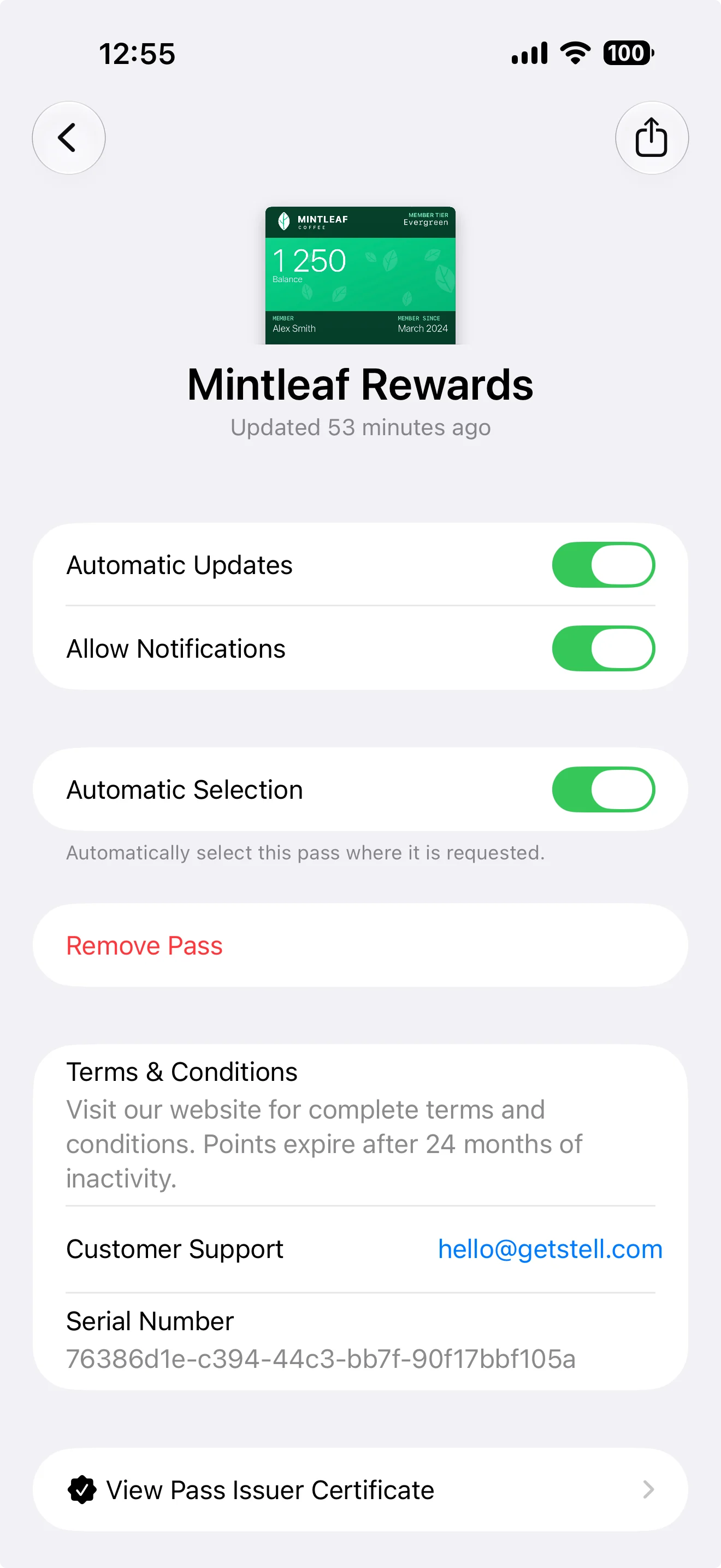 The toggles above your back fields belong to the wallet, not your template — each customer controls them on their own device. Knowing what they do helps when a customer reports a pass that "isn't working":
| Wallet control | What it does |
| ----------------------- | ---------------------------------------------------------------------------------------------------------------------------------------------------------------------------------------------------------------------- |
| **Automatic Updates** | Lets the pass receive changes from your program — new field values and design updates. If a customer turns this off, their pass keeps its old content until they turn it back on |
| **Allow Notifications** | Whether this pass may show notifications on the customer's lock screen, including the messages you send to it. Turned off, the pass still updates — just silently |
| **Show on Lock Screen** | Whether the pass may surface on the lock screen when the customer is near one of its [locations](/pass-templates/barcodes#also-in-the-advanced-tab). This toggle only appears when the pass template has locations set |
| **Automatic Selection** | Lets the iPhone present this pass automatically where it's requested — for tap-to-use programs, this is what brings up the right pass at the Terminal without the customer hunting for it |
| **Remove Pass** | Deletes the pass from this device |
The **Serial Number** on the back of the pass is the same value as the **Pass ID** on the pass detail page in the portal — a customer can read it to you to confirm you're both looking at the same pass. See [passes](/passes/overview).
The editor also offers **footer fields**. These only appear on the [generic poster layout](#layout-by-style), as a final line at the very bottom of the pass — on other layouts, keep your content in the areas above.
## Pass styles
The **pass style** (chosen in the **Settings** tab) decides the overall layout — most importantly whether the pass uses a strip image or a full background:
The toggles above your back fields belong to the wallet, not your template — each customer controls them on their own device. Knowing what they do helps when a customer reports a pass that "isn't working":
| Wallet control | What it does |
| ----------------------- | ---------------------------------------------------------------------------------------------------------------------------------------------------------------------------------------------------------------------- |
| **Automatic Updates** | Lets the pass receive changes from your program — new field values and design updates. If a customer turns this off, their pass keeps its old content until they turn it back on |
| **Allow Notifications** | Whether this pass may show notifications on the customer's lock screen, including the messages you send to it. Turned off, the pass still updates — just silently |
| **Show on Lock Screen** | Whether the pass may surface on the lock screen when the customer is near one of its [locations](/pass-templates/barcodes#also-in-the-advanced-tab). This toggle only appears when the pass template has locations set |
| **Automatic Selection** | Lets the iPhone present this pass automatically where it's requested — for tap-to-use programs, this is what brings up the right pass at the Terminal without the customer hunting for it |
| **Remove Pass** | Deletes the pass from this device |
The **Serial Number** on the back of the pass is the same value as the **Pass ID** on the pass detail page in the portal — a customer can read it to you to confirm you're both looking at the same pass. See [passes](/passes/overview).
The editor also offers **footer fields**. These only appear on the [generic poster layout](#layout-by-style), as a final line at the very bottom of the pass — on other layouts, keep your content in the areas above.
## Pass styles
The **pass style** (chosen in the **Settings** tab) decides the overall layout — most importantly whether the pass uses a strip image or a full background:
 | Style | Visual base | Typical use |
| ----------------- | --------------------------------------------------------------------------------------------------------- | -------------------------------------------------------------- |
| **Store Card** | Strip image | Loyalty and membership cards — the most common choice |
| **Coupon** | Strip image | Offers and vouchers |
| **Generic** | Background image — or the [poster layout](#layout-by-style) with full-bleed artwork on the newest iPhones | Anything that doesn't fit the other styles |
| **Event Ticket** | Strip image, or a full-poster layout with its own artwork on newer iPhones | Events and entry passes |
| **Boarding Pass** | Background image | Travel — also allows 5 secondary/auxiliary fields instead of 4 |
Switching style keeps your fields and images but changes how they're laid out — check the preview after switching, since a strip image won't show on a background-based style and vice versa.
## Layout by style
Each style arranges the same areas differently. The two **poster** variants are the new, modern pass presentations: full-bleed artwork carries the design, and they activate automatically on newer iPhones when your template has poster artwork.
The most common layout — and the one used by most loyalty programs: strip image with the primary field on it, and secondary and auxiliary fields **sharing one row** — up to 4 fields in total, kept short so they fit. The Coupon style is laid out the same way; it reads as an offer, where a store card reads as a membership.
| Style | Visual base | Typical use |
| ----------------- | --------------------------------------------------------------------------------------------------------- | -------------------------------------------------------------- |
| **Store Card** | Strip image | Loyalty and membership cards — the most common choice |
| **Coupon** | Strip image | Offers and vouchers |
| **Generic** | Background image — or the [poster layout](#layout-by-style) with full-bleed artwork on the newest iPhones | Anything that doesn't fit the other styles |
| **Event Ticket** | Strip image, or a full-poster layout with its own artwork on newer iPhones | Events and entry passes |
| **Boarding Pass** | Background image | Travel — also allows 5 secondary/auxiliary fields instead of 4 |
Switching style keeps your fields and images but changes how they're laid out — check the preview after switching, since a strip image won't show on a background-based style and vice versa.
## Layout by style
Each style arranges the same areas differently. The two **poster** variants are the new, modern pass presentations: full-bleed artwork carries the design, and they activate automatically on newer iPhones when your template has poster artwork.
The most common layout — and the one used by most loyalty programs: strip image with the primary field on it, and secondary and auxiliary fields **sharing one row** — up to 4 fields in total, kept short so they fit. The Coupon style is laid out the same way; it reads as an offer, where a store card reads as a membership.
 The primary field renders **larger, in the top section**. Unlike store cards, secondary and auxiliary fields stay on **separate rows** — up to 4 each, for a total of 8 displayed fields.
 The modern take on the generic pass, on iPhones running **iOS 27 and later**. The **artwork is the pass** — it fills the whole front (an automatic dark gradient keeps the top readable; you can turn it off in the editor's visual options). The **barcode moves to the center**, **primary fields move to the bottom**, and **footer fields appear** as a final line. The **Primary Logo** slot replaces your regular logo at the top, falling back to it if not set.
If you configure a generic poster, customers on **iOS 26 and earlier** automatically see the standard **Generic** layout instead — so keep the standard images and fields in good shape. One template serves both.
The modern take on the generic pass, on iPhones running **iOS 27 and later**. The **artwork is the pass** — it fills the whole front (an automatic dark gradient keeps the top readable; you can turn it off in the editor's visual options). The **barcode moves to the center**, **primary fields move to the bottom**, and **footer fields appear** as a final line. The **Primary Logo** slot replaces your regular logo at the top, falling back to it if not set.
If you configure a generic poster, customers on **iOS 26 and earlier** automatically see the standard **Generic** layout instead — so keep the standard images and fields in good shape. One template serves both.
 Recognizable by the **curved notch at the top** — the classic ticket cutout. It's also the only style with a **thumbnail**: a square image beside the primary field. Put the event name in the primary field, the venue in secondary, and time/seat details in auxiliary. A strip image replaces the thumbnail row when used.
 The modern event ticket, on iPhones running **iOS 18 and later** — structured like the generic poster: full-bleed **artwork**, the **Primary Logo** at the top with the date and time opposite, the **barcode as a band** across the pass, and event details and seat information along the bottom. Event tickets also get extra poster slots in the editor: a **Secondary Logo** and a **Venue Map**.
Customers on **iOS 17 and earlier** automatically see the standard **Event Ticket** layout instead — the same template serves both.
The modern event ticket, on iPhones running **iOS 18 and later** — structured like the generic poster: full-bleed **artwork**, the **Primary Logo** at the top with the date and time opposite, the **barcode as a band** across the pass, and event details and seat information along the bottom. Event tickets also get extra poster slots in the editor: a **Secondary Logo** and a **Venue Map**.
Customers on **iOS 17 and earlier** automatically see the standard **Event Ticket** layout instead — the same template serves both.
 Origin and destination render large as the primary fields. Two quirks are unique to this style: **auxiliary fields sit above secondary fields**, and rows fit up to **5 fields** instead of 4.
## How this knowledge maps to the editor
* The wallet draws the pass; you supply the ingredients. You can't move the areas around — you decide what goes *in* each area.
* Less is more: passes are glanced at, not read. A strong image, one primary value, and a couple of supporting fields beat a crowded layout.
* Field values can be **dynamic** — showing each customer their own name, balance, or tier. See [fields and dynamic content](/pass-templates/fields).
Want to go deeper? Apple's developer documentation covers the underlying pass format in technical detail — see [Wallet Passes](https://developer.apple.com/documentation/walletpasses) on the Apple Developer site. You won't need it to use the editor; everything merchant-relevant is covered in these pages.
Origin and destination render large as the primary fields. Two quirks are unique to this style: **auxiliary fields sit above secondary fields**, and rows fit up to **5 fields** instead of 4.
## How this knowledge maps to the editor
* The wallet draws the pass; you supply the ingredients. You can't move the areas around — you decide what goes *in* each area.
* Less is more: passes are glanced at, not read. A strong image, one primary value, and a couple of supporting fields beat a crowded layout.
* Field values can be **dynamic** — showing each customer their own name, balance, or tier. See [fields and dynamic content](/pass-templates/fields).
Want to go deeper? Apple's developer documentation covers the underlying pass format in technical detail — see [Wallet Passes](https://developer.apple.com/documentation/walletpasses) on the Apple Developer site. You won't need it to use the editor; everything merchant-relevant is covered in these pages.